Enhancing the Look of CSS Checkboxes and Radio Buttons Without JavaScript
If you’re looking to customize the appearance of checkboxes or radio buttons using just CSS, you’re in the right place. This guide will walk you through the process step-by-step, allowing you to create stylish and functional form elements without the need for JavaScript.
Customizing CSS Checkboxes
Let’s start by styling a checkbox. Here’s the HTML structure we’ll use:
<label>
    <input class="radio" type="radio" name="radio-test">
    <span class="radio-custom"></span>
    <span class="label">Lorem ipsum dolor sit amet, consectetur</span>
</label>
This markup consists of three key elements:
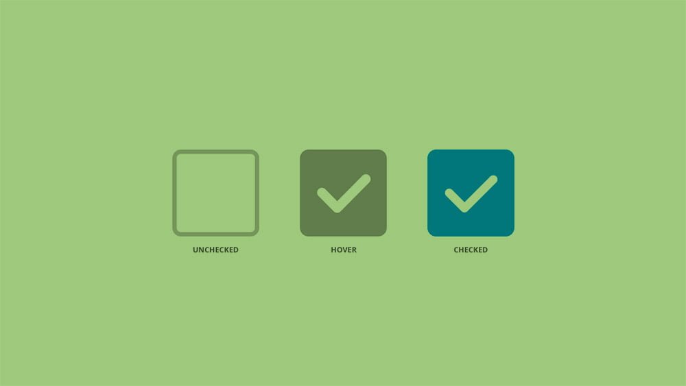
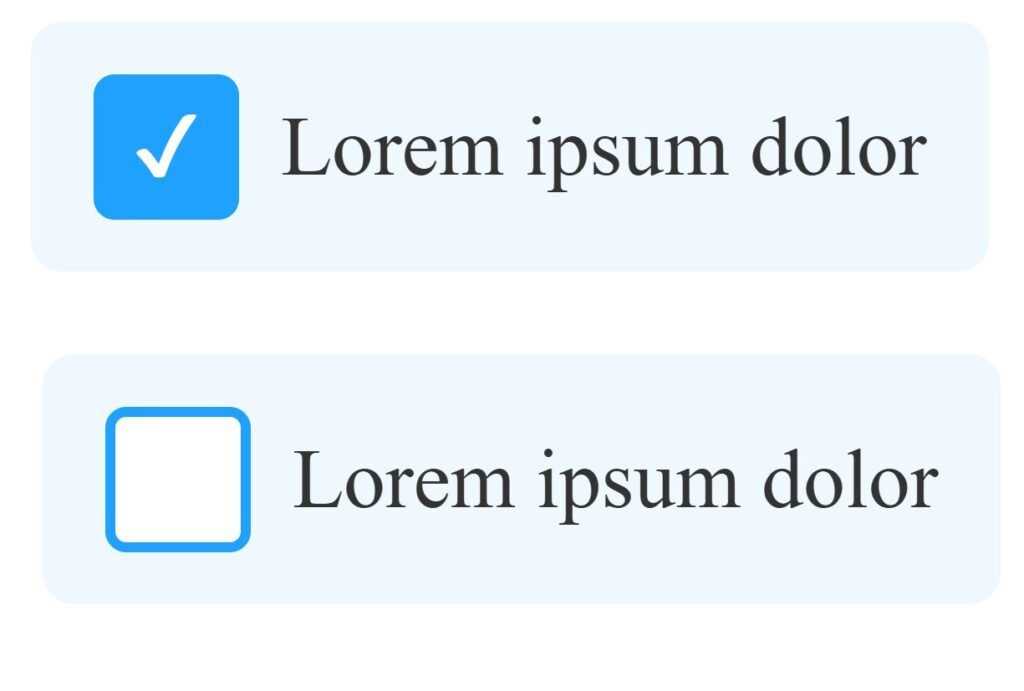
.checkbox: This is the actual checkbox input..checkbox-custom: This is the custom element that we’ll style to look like a checkbox..label: This is the label text displayed to the right of the checkbox.
Remember, all these elements must be wrapped in a <label> tag for the functionality to work seamlessly. If you want the checkbox to be checked by default, simply add the checked attribute to the input element.
Adding the CSS
Now, let’s add the CSS styles to bring our custom checkbox to life:
<style>
/* Hide the native checkbox */
.checkbox {
  display: none;
}

/* Base styles for the custom box */
.checkbox-custom {
  position: relative;
  width: 24px;
  height: 24px;
  border: 2px solid #888;
  border-radius: 4px;
  background: #fff;
  transition: border-color 0.2s, background-color 0.2s;
  cursor: pointer;
  margin-right: 8px;
}

/* Hover / focus state */
label:hover .checkbox-custom,
.checkbox:focus + .checkbox-custom {
  border-color: #1fa2ff;
}

/* Checked state background */
.checkbox:checked + .checkbox-custom {
  background: #1fa2ff;
  border-color: #1fa2ff;
}

/* Checkmark */
.checkbox:checked + .checkbox-custom::after {
  content: "✔";
  position: absolute;
  top: 50%;
  left: 50%;
  transform: translate(-50%, -55%);
  font-size: 16px;
  color: white;
}

/* Label text styles */
.label {
  display: inline-block;
  vertical-align: middle;
  font-size: 16px;
  color: #333;
  cursor: pointer;
}

/* Spacing and padding for touch friendliness */
label {
  display: inline-flex;
  align-items: center;
  padding: 10px 12px;
  border-radius: 6px;
  transition: background-color 0.2s;
}

/* Label hover background */
label:hover {
  background-color: #f0f8ff;
}
</style>
If you’re familiar with basic CSS, this should be straightforward. For beginners, here’s a quick breakdown:
- Hiding the Real Checkbox: We hide the actual checkbox because styling it directly across browsers is challenging. Instead, we use a trick—hide the real checkbox and display a custom-styled box (
.checkbox-custom). - Styling the Custom Checkbox: We position this custom element relative to its container and set its dimensions and border properties.
- Reflecting the Checked State: When the real checkbox is checked, the custom checkbox displays a pseudo-element (
::before) that acts as a visual indicator, like a tick or a filled box.
Customizing Radio Buttons
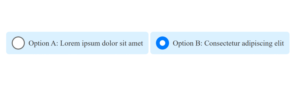
Styling radio buttons follows a similar approach. Here’s the HTML structure:
<label>
    <input class="radio" type="radio" name="radio-test">
    <span class="radio-custom"></span>
    <span class="label">Option A: Lorem ipsum dolor sit amet</span>
  </label>

  <label>
    <input class="radio" type="radio" name="radio-test">
    <span class="radio-custom"></span>
    <span class="label">Option B: Consectetur adipiscing elit</span>
  </label>
And the corresponding CSS:
<style>
    :root {
      /* Accessible blue accent and a darker shade for hover */
      --accent: #007bff;
      --accent-dark: #0056b3;
      --border-default: #666;
    }

    /* Hide the native inputs */
    .checkbox,
    .radio {
      display: none;
    }

    /* Base box styles */
    .checkbox-custom,
    .radio-custom {
      position: relative;
      width: 24px;
      height: 24px;
      border: 2px solid var(--border-default);
      background: #fff;
      cursor: pointer;
      margin-right: 8px;
      transition: none; /* remove smooth transition per request */
    }

    /* Radio circle */
    .radio-custom {
      border-radius: 50%;
    }

    /* Hover: just darken the border/background */
    .checkbox-custom:hover,
    .radio-custom:hover {
      border-color: var(--accent-dark);
    }
    .checkbox:checked + .checkbox-custom:hover,
    .radio:checked + .radio-custom:hover {
      background: var(--accent-dark);
      border-color: var(--accent-dark);
    }

    /* Checked: solid accent color */
    .checkbox:checked + .checkbox-custom,
    .radio:checked + .radio-custom {
      background: var(--accent);
      border-color: var(--accent);
    }

    /* Checkmark for checkbox */
    .checkbox:checked + .checkbox-custom::after {
      content: "✔";
      position: absolute;
      top: 50%;
      left: 50%;
      transform: translate(-50%, -55%);
      font-size: 16px;
      color: #fff;
    }

    /* Inner dot for radio */
    .radio:checked + .radio-custom::after {
      content: "";
      position: absolute;
      width: 12px;
      height: 12px;
      background: #fff;
      border-radius: 50%;
      top: 50%;
      left: 50%;
      transform: translate(-50%, -50%);
    }

    /* Label text and spacing */
    .label {
      font-size: 16px;
      color: #333;
      cursor: pointer;
	  background: #c8e9ffa6;
    }

    /* Entire label area for better hit target */
    label {
      display: inline-flex;
      align-items: center;
      padding: 10px 12px;
      border-radius: 6px;
      /* no hover background per request */
    }
  </style>
Final Thoughts
This method is convenient and does not require JavaScript, allowing your forms to behave as expected, even when resetting. The only drawback is the need for “empty” elements like .checkbox-custom and .radio-custom, which serve no semantic purpose in the HTML. However, with a bit of creativity, you can replace these with pseudo-elements, eliminating the need for extra markup.